Team Reports
ContributorIQ's reporting feature transforms raw Git data into actionable insights about your team's development activity. Whether you're preparing for a quarterly review, assessing team health, or identifying knowledge gaps, the Team Report provides a comprehensive view of your engineering organization's contributions.
Accessing Reports
After completing an audit for your organization, navigate to the audit detail page and click the Generate Report button. The report reflects the same time period filter you've selected on the audit page. If you want to generate a report for a specific timeframe such as "Last 30 days" or "This quarter," select that filter before clicking Generate Report.
Reports are available in two formats. The interactive HTML version displays directly in your browser and includes charts and visualizations. The PDF export provides a print-ready document suitable for sharing with stakeholders who may not have access to ContributorIQ.
Understanding the Executive Summary
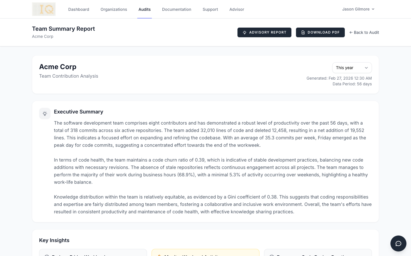
Every report begins with an AI-generated executive summary that synthesizes your team's metrics into a narrative overview. This summary is produced by analyzing anonymized statistics. No code, repository names, or contributor names are ever sent to the AI service. The summary highlights key strengths, areas for potential improvement, and notable patterns in your team's development activity.
The executive summary considers factors such as commit distribution across the week, the balance between code growth and refactoring, and how evenly work is distributed among team members. It provides a starting point for discussions about team dynamics and process improvements.
Overview Statistics
The top of the report displays four headline metrics that summarize your team's activity during the reporting period.
Total Commits represents the number of individual commits made across all repositories in your organization. This metric counts commits from all active (non-merged) contributors and excludes any contributors you've marked as former employees.
Lines Added shows the cumulative count of new lines of code introduced during the period. This includes all file types tracked by Git, from source code to configuration files and documentation.
Lines Deleted indicates how many lines were removed during the period. A healthy codebase typically shows meaningful deletion activity, as teams refactor, remove deprecated code, and consolidate functionality.
Contributors displays the count of unique team members who made at least one commit during the reporting period. This count respects your contributor merge settings, so if you've merged duplicate identities, they appear as a single contributor.
Productivity Patterns
The Productivity by Day of Week chart reveals when your team is most active. The visualization shows commit counts for each day from Monday through Sunday, helping you understand your team's natural rhythm. Most teams exhibit higher activity mid-week, with reduced commits on Mondays (often spent in meetings and planning) and Fridays (when teams may avoid deploying new code before the weekend).
The Productivity by Hour chart provides an even more granular view, showing commit distribution across all 24 hours. This can reveal whether your team operates primarily during business hours or if significant work happens outside the traditional workday. Teams distributed across time zones often show a broader spread of activity throughout the day.
Work Patterns
The Work Patterns widget quantifies your team's work-life balance through two key percentages.
Business Hours shows what percentage of commits occur between 9 AM and 5 PM on weekdays. A high percentage here indicates that most development work happens during standard working hours, which often correlates with better work-life balance and more sustainable development practices.
Weekend Commits indicates the proportion of work done on Saturdays and Sundays. While some weekend activity is normal (especially for open-source projects or teams with flexible schedules), consistently high weekend percentages may indicate deadline pressure, understaffing, or cultural issues worth addressing.
Code Health Metrics
The Code Health widget presents four metrics that together paint a picture of your codebase's evolution and your team's knowledge distribution. These metrics help engineering leaders identify potential risks and opportunities for improvement.
Churn Ratio
The churn ratio measures the relationship between deleted and added lines of code, calculated as lines deleted / lines added. A ratio of 0.5 means that for every two lines added, one line was deleted.
A very low churn ratio (approaching 0) suggests the codebase is growing rapidly with minimal refactoring. While this may be appropriate during early product development, sustained low churn in a mature codebase could indicate accumulating technical debt.
A moderate churn ratio (0.3 to 0.7) typically indicates healthy development practices where the team balances new feature development with code maintenance and refactoring.
A high churn ratio (approaching or exceeding 1.0) may indicate significant refactoring efforts, code migrations, or architectural changes. This is expected during planned cleanup initiatives but could warrant investigation if unexpected.
Net Lines
Net lines represents the difference between lines added and lines deleted during the reporting period. A positive number (displayed in green) means the codebase grew; a negative number (displayed in red) means it shrank.
Codebase growth is neither inherently good nor bad. Early-stage products typically show significant positive net lines as features are built out. Mature products may show slower growth or even periods of negative net lines during refactoring initiatives. The key is understanding whether the trend aligns with your team's current focus.
Bus Factor
The bus factor answers a critical question: how many team members would need to leave before essential knowledge is lost? It calculates the minimum number of contributors required to account for 50% of all commits.
A bus factor of 1 indicates dangerous knowledge concentration. A single person is responsible for the majority of commits, and their departure would significantly impact the team's velocity and institutional knowledge.
A bus factor of 2 or 3 is common for small teams but represents moderate risk. Consider cross-training initiatives and documentation improvements to distribute knowledge more broadly.
A higher bus factor indicates healthy knowledge distribution across the team. Work is spread among multiple contributors, reducing the impact of any single departure.
Knowledge Concentration
Knowledge concentration is measured using the Gini coefficient, a statistical measure of inequality commonly used in economics. In ContributorIQ, it measures how evenly commits are distributed among contributors.
A value of 0 would indicate perfect equality, meaning every contributor has made exactly the same number of commits. In practice, this never occurs.
A value approaching 1 indicates extreme concentration, where one contributor has made nearly all the commits while others have contributed minimally.
Most teams fall somewhere between 0.3 and 0.7. Values below 0.4 suggest relatively even distribution, while values above 0.6 may indicate that a small number of contributors dominate development activity. High concentration isn't always problematic, as senior developers may naturally contribute more. However, extremely high values warrant investigation to ensure junior team members have opportunities to contribute meaningfully.
Team Velocity
The Team Velocity chart visualizes your team's output over time, grouped by week. Each data point shows the number of commits and lines of code changed during that week, along with the number of active contributors.
Look for patterns in velocity trends. Consistent velocity suggests stable team performance. Significant dips may correlate with holidays, team changes, or blocked work. Spikes might indicate release pushes or the resolution of previously blocked work.
The velocity chart is particularly useful for identifying:
- Seasonal patterns in your team's productivity
- The impact of team changes on overall output
- Whether workload is steady or highly variable
- Recovery time after major releases or incidents
Top Contributors
The Top Contributors section ranks team members by their commit count during the reporting period. For each contributor, the report shows their total commits, lines added, lines deleted, and the number of repositories they've contributed to.
This section helps identify your most active contributors while also revealing the breadth of their involvement. A contributor with high commits across many repositories demonstrates broad codebase familiarity, while someone with concentrated activity in fewer repositories may be developing deep expertise in specific areas.
Top Repositories
The Top Repositories section identifies which codebases received the most attention during the reporting period. For each repository, you'll see commit counts, contributor counts, and lines changed.
This information helps answer questions like:
- Which products or services are under active development?
- Are maintenance repositories receiving appropriate attention?
- Is development activity aligned with business priorities?
Exporting Reports
Click the Download PDF button to generate a portable document version of the report. The PDF includes all metrics and statistics presented in a print-friendly format. Charts are rendered as static images suitable for printing or sharing via email.
PDF reports are particularly useful for:
- Including in executive presentations
- Sharing with stakeholders outside your organization
- Archiving historical snapshots of team performance
- Printing for offline review during meetings
Privacy and Security
ContributorIQ takes data privacy seriously. When generating the AI-powered executive summary, only anonymized aggregate statistics are sent to the AI service. This includes:
- Total counts (commits, lines added, lines deleted)
- Percentages (weekday distribution, business hours percentage)
- Statistical measures (Gini coefficient, churn ratio)
The following information is never transmitted to external services:
- Repository names or URLs
- Contributor names or email addresses
- Commit messages or code content
- File paths or directory structures
- Any identifying information about your organization
This approach allows ContributorIQ to provide AI-generated insights while maintaining the confidentiality of your intellectual property and team information.
Advisory Reports
In addition to the standard team summary, ContributorIQ offers AI-powered Advisory Reports that provide tailored analysis for different audiences. Unlike the executive summary (which uses anonymized data), advisory reports include real contributor and repository names for actionable specificity.
Three audience presets are available: Executive, Engineering Manager, and M&A Due Diligence. Each preset frames the same underlying metrics differently, emphasizing the concerns most relevant to that audience.
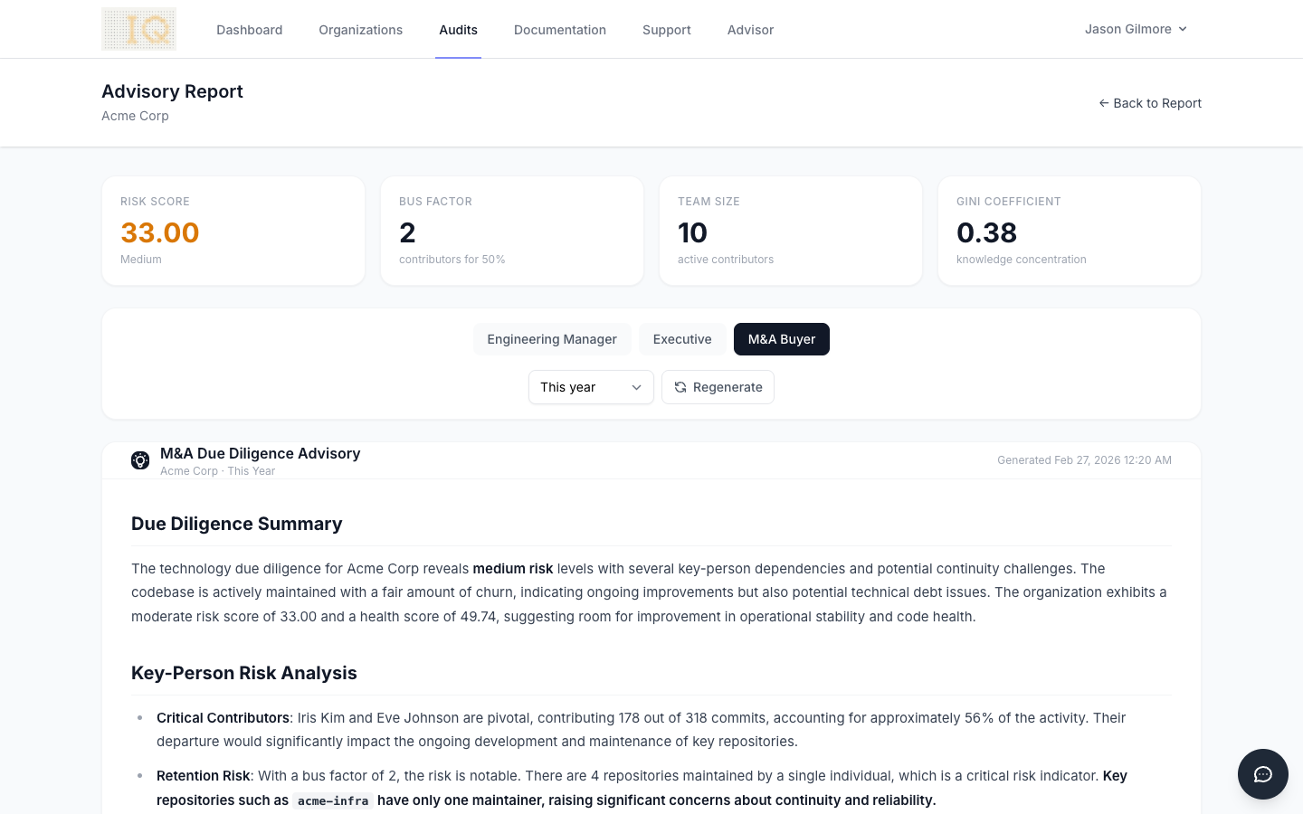
Advisory reports support time period filtering and are cached per audit, audience type, and prompt version. Click the Regenerate button to produce a fresh report at any time.